Free Time Finder
A time management app which helps groups organize and schedule events or tasks.
Introduction
Section: 0303 - Team #1
- Carter Stark

- Max Jih-Vieira
- Zara Baig
- Aminata Kourouma
- Sarah Bamba

- Ethan Bikos
Introduction
Our project centers on the issue of time management and time coordination. In the Who We Are survey for INST362, 57.3% of students stated that time management is their hardest struggle, 28.9% said group coordination, and 38.6% stated keeping up with deadlines. However, time management/coordination is not just an academic issue; planning a day to hangout with friends can be tough when everyone has a busy college student schedule. Our project is aiming to create a quick, user-friendly solution for friends, students, and teams to find a common time to meet.
Problem Statement
People's schedules are all disconnected, so comparing schedules is a hassle for most people, and even with apps like Google Calendar available, the formatting of the app is not ideal for finding gaps in schedules between people, so Free Time Finder will address this problem by orienting its UI to be concise and easy to understand for everyone comparing their schedules.
Research Question
What are we trying to find out?- How do students manage their time?
- What is the best method of coordinating meeting times in groups?
- How do people currently organize their schedules with other people?
What do we need to learn?
- How do students currently plan their time with others?
- What issues do students currently run into when using Google Calendar, group chats, etc.?
Goal
Managing time can be a challenge because schedules become overly crowded due to classes, work, school, and other personal commitments. It also comes with a lot of back and forth messages until you realize when everyone is actually free to meet up, hang out, study, or work on group projects. So our goal is to make a user-friendly tool that will help people better plan and determine when they can be free during the week. From the interviews, we would like to know how people manage their time currently and what time management issues they encounter, like on other platforms. This will help us develop a strong design that will allow users to view their free slots and organize things without all the confusion.
Research
Overview
We conducted interviews and sent out a survey to collect data and interact with our target audience. Given how our project is focused on a broad issue, we felt as if it was appropriate to expand our research scope to the general UMD body instead of just INST362 students. We chose to do interviews to get specific descriptive data about how students manage their time, and we added on surveys to gain quantitative numbers for statistical analysis.
Interviews
When conducting interviews, we asked questions similar to the following:
- What current methods do you use to schedule events or work?
- How do you currently organize your schedule?
- What is the most difficult part about scheduling with others?
- Specifically, what ideas or systems would you want implemented in a group-planning app?
- Do you have any suggestions or questions for us to take into consideration?
Observation
We also used observation as a method to better understand how students use their current scheduling tools. The observations occurred during the interviews where we would ask them to demonstrate their current apps and websites, and how they interacted with them. This allowed us to physically see what they do rather than simply relying on what they were saying in the interviews.
Surveys
We began by distributing a survey to students through Canvas and by creating a flyer to encourage people to complete. We believed that surveys are an easy way of collecting large amounts of data. The survey consisted of 14 questions. The first 4 questions were centered around user statistics to help us understand our audience. The next 5 were to gather insight about their personal time management. The last 5 questions were geared towards how our respondents schedule plans and the issues surrounding it. We also decided a survey would appropriately help us narrow down our research and prepare for our second method of data collection, interviews.
Reflection
We found that the largest issue students face is not only time management, but planning with others as well. Our research showed that currently used tools are not suitable enough for group collaborations, that time management tools are as effective as the consistency with which the user uses them, and this means that the quality of these tools fails when students are not in the habit of adjusting their schedules frequently. There are still a few unresolved questions regarding the impact of several factors, including extracurricular activities, major, and academic workload, on scheduling problems in a more significant population. We plan to continue to develop our solution, Free Time Finder, delivering a convenient and simple website, allowing users to effortlessly input and designate available times before locating common free time.
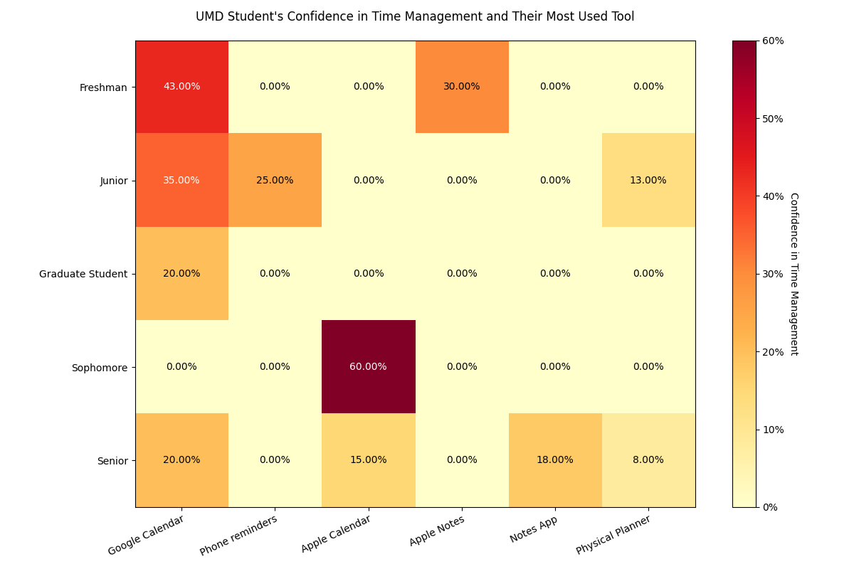
Visualizations
Figure 1
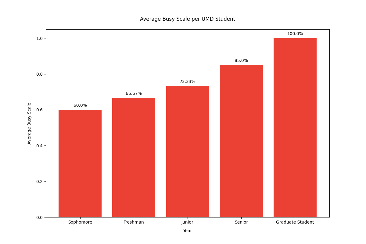
Figure 2
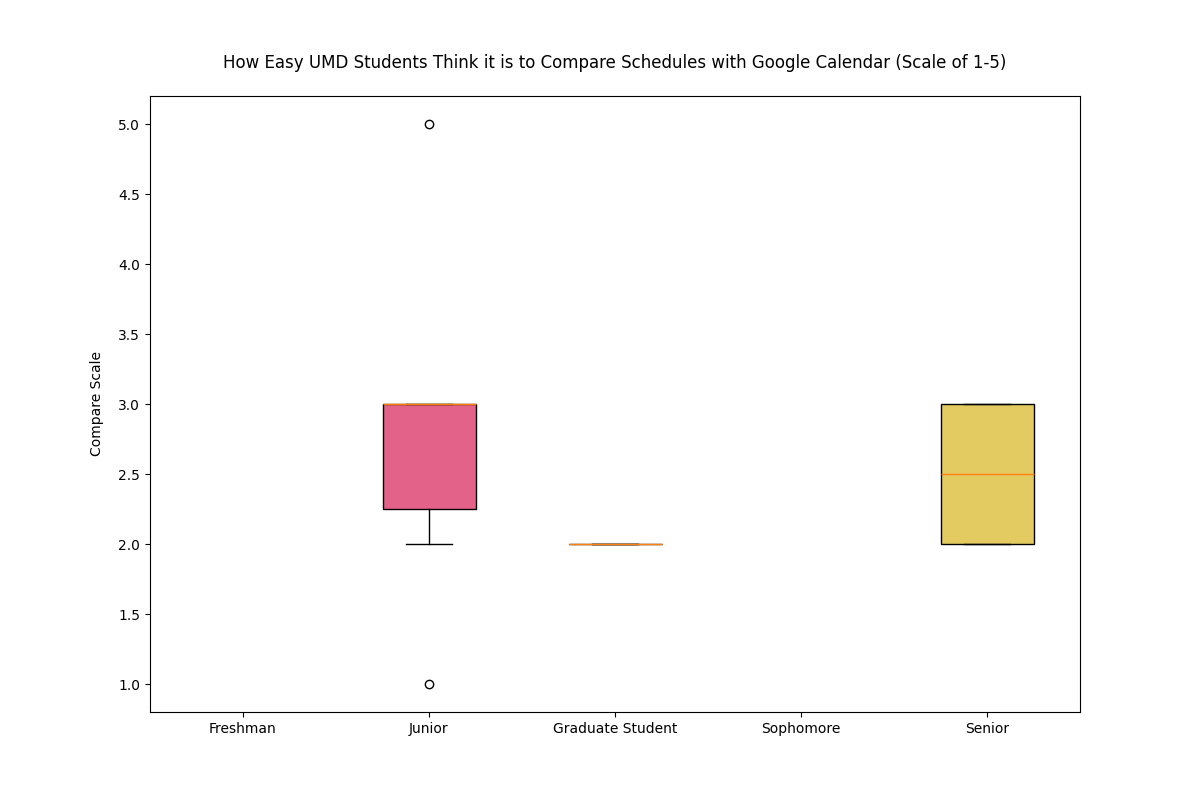
Figure 3
Brainstorming
User's Challenge
The problem we are exploring is that people's schedules are all disconnected so comparing them can be frustrating. Even with apps like Google Calendar available, the formatting is not ideal for finding gaps in schedules between people, so Free Time Finder will address this problem by orienting its UI to be concise and easy to understand for schedule comparison. Through this project, our goal is to address the 57.3% of students concerned about time management and the 28.9% of students concerned about group coordination. We will have a fully designed semi-functional website that allows users to enter their availability and view overlapping free time in an efficient manner.
Ideas
Below are some ideas we had for Free Time Finder.
- Organize schedules based on groups, can possibly have banners to highlight different groups
- Color gradients to have a visual metric for days of availability (darkest = most availability)
- Drag and drop feature for an easy user interface.
- An option for preference of dates/times. Ex. "I can meet on 4/8 at 8:00pm but wouldn't prefer it."
- Automatic “free” space area that would show spaces that do not have events in them. Could be manipulated to not show specific times like night.
- A notification system that lets users know when their friends availability changes
- Streamlined importing of other calendars (allows you to pick which events to include in the app to share)
- A follow option that lets users follow the people they want to plan hangouts with
- Make certain events pop out more based on priority, could pop out more with 3D effects or bright borders
- An option for meeting time polls for hangouts and group projects.
We chose to use the color gradient idea, because it provides easy information retrieval which was a main point participants of the survey requested.
Sketches
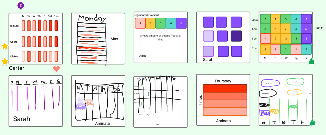
We chose to use the first sketch idea, because it provides a simple visualization which makes it easy for users to see and understand what days their friends or group members are busy.
Hypothesis
We believe that a color gradient-based shared calendar event organization style for UMD students trying to coordinate schedules with their peers will reduce the amount of time students spend coordinating schedules and improve efficiency.
Personas
Rimuru Tempest
Role: Team Lead
About: Rimuru is a hard working individual who enjoys hanging out with friends during their free time.
Routine
- Grabs breakfast
- Greets everyone in town
- Works in the lab
- Grabs lunch
- Leads meetings with peers
- Grabs dinner
- Hangs out with friends and relaxes
- Goes to bed
Needs
- A simple interface for scheduling
- Color coded visuals for organization
- See other's availability
- A system for scheduling events ahead of time
Struggles
- Difficult to figure out when peers are free
- Sometimes loses track of time
Goals
- Plan ahead with friends
- Easily see when the next meetings are
- Quickly schedule events with an easy interface
 Diablo
Role: Project Manager
About: Diablo is always determined to complete tasks efficiently and perseveres in every job he receives from Rimuru.
Routine
- Grabs breakfast
- Plans meetings
- Grabs lunch
- Works with peers
- Grabs dinner
- Finishes any work left for the day
- Goes to bed
Needs
- Real time schedule data
- An easy system for scheduling meetings
- See other's availability
Struggles
- Difficult to figure out what the best times are to schedule a meeting
- Sometimes runs into schedule conflicts with others
Goals
- Plan ahead for meetings
- Easily see when the next meetings are
- Keep schedules organized
 Gobta
Gobta
Role: Supervisor
About: Gobta enjoys having free time and finding ways to make work more fun. He tends to hang around his friends whenever possible.
Routine
- Grabs breakfast
- Works on projects
- Checks in on peers
- Grabs lunch
- Works with peers
- Grabs dinner
- Hangs out with friends to relax
- Goes to bed
Needs
- Real time schedule data
- Color coded visuals for organization
- See other's availability
Struggles
- Difficult to figure out everyone else's schedules
- Will often lose track of time
Goals
- Plan ahead with friends
- Easily see when the next meetings are
- Keep schedules organized
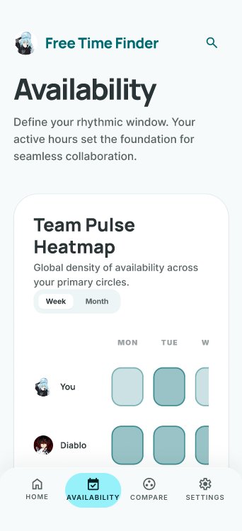
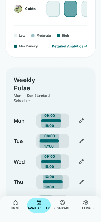
Prototype
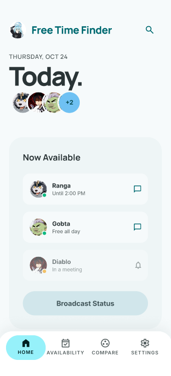
Home Page
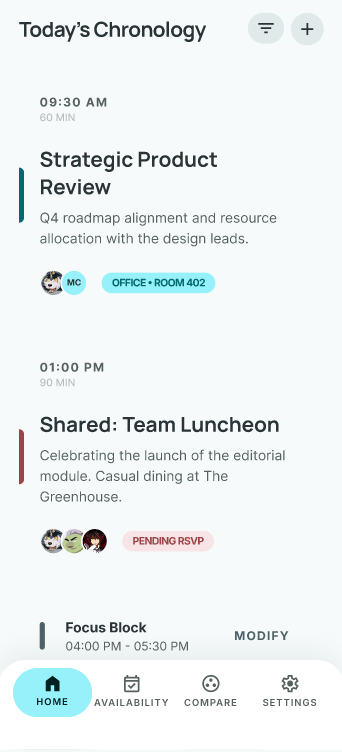
Availability Page
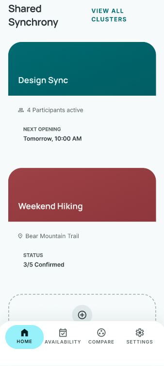
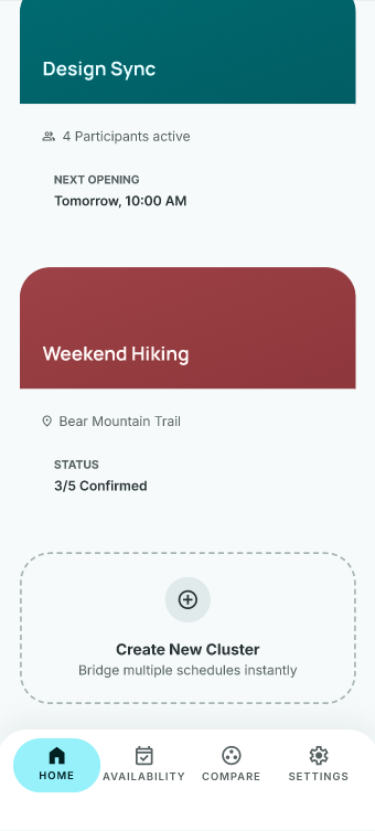
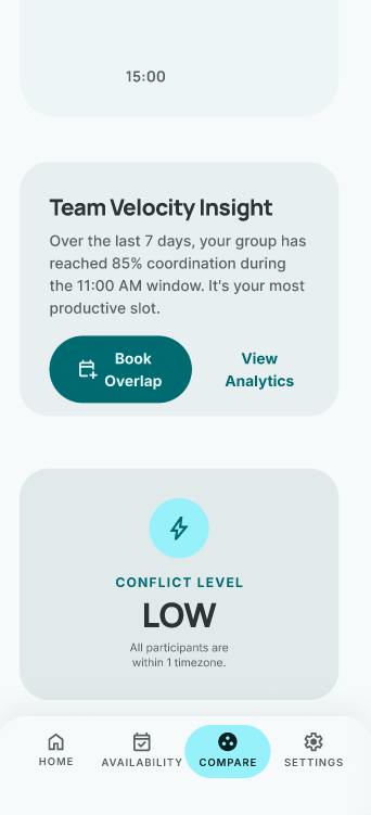
Compare Schedules Page
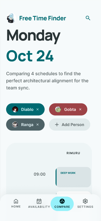
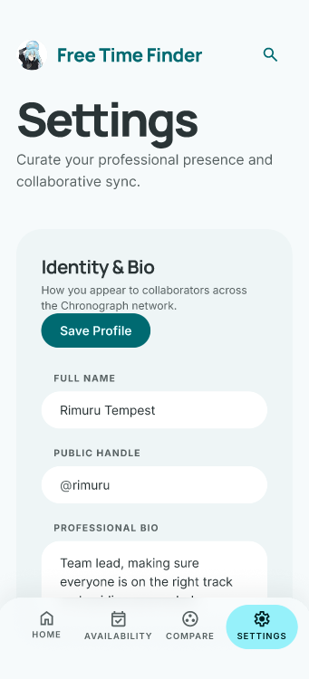
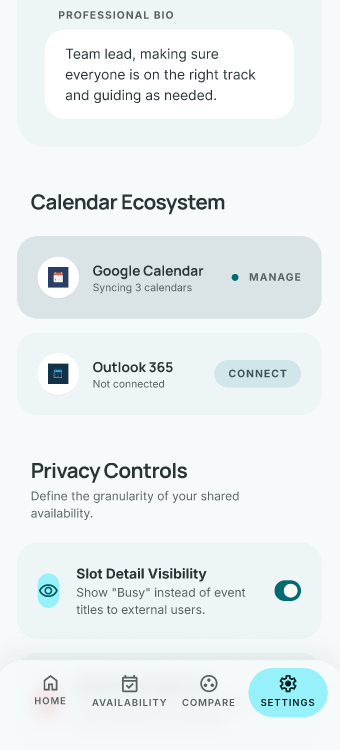
Settings Page
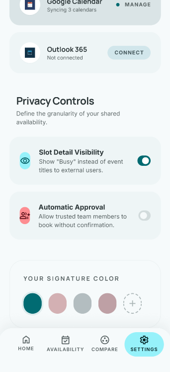
Details
If you are interested, you can check out the Figma prototype here.
About The Prototype
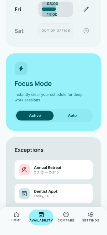
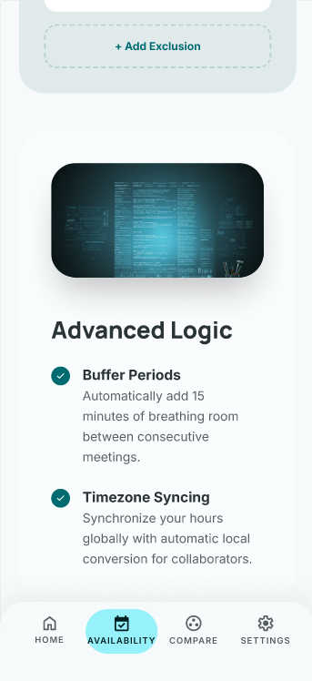
Our prototype was created using Google Stitch, an AI design tool we used to create a rough visualization of our app. Using insights from our brainstorming, we tried to prompt a prototype that roughly demonstrated what our availability heat map would look like. This design feature is meant to provide a visually appealing and information-efficient way of displaying each member of a group's availability to solve the problem of coordinating schedules with other people. Instead of working those details out verbally or through text, we felt that it is a much better method to use a color heat map. The key features of our prototype are a color coded heat map showing the time availability, a simple interface that does not require constant communications, and the visual comparison of schedules. Our prototype has 4 screens, a homepage, a page showcasing availability, one for schedule comparison, and settings. Each screen is essential to our app design and effectively addresses the problem we aim to solve. One of our features in our prototype shows the real time notification system that we want to incorporate in the app.
Testing
Usability Testing Plan
To test our prototype and receive feedback on it, our team designed eight scenarios and tasks for participants to go through and review, providing criticisms and suggestions to improve our model and make it flow better for a new user who would be unfamiliar with the app. Six participants of varied backgrounds were selected for the test to ensure a diversified test group. To perform our tests, we had each member hold interview-like meetings with their participant where they would give them a task and record how well the participant performed the task. Afterwards, they would be prompted to use a likert scale to rate the task and how much the participant liked the area in question, as well as any other comments they had for the model they just went through. In doing this, we wanted to compare how well users were able to navigate through our prototype with our own criteria and get a more comprehensive understanding of user's opinions.
Usability Testing Analysis & Results
We were able to then analyze our results from testing both qualitative and quantitatively. We were able to create boxplots for each testing that showed summary statistics of their likert rating and accuracy ranges, shown here:
Figure 4
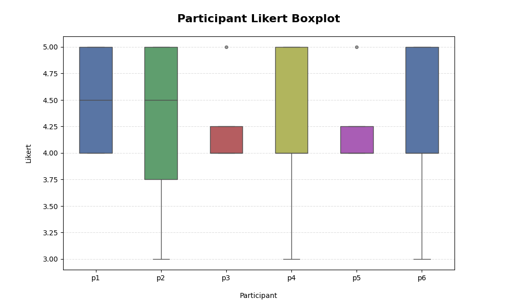
Figure 5
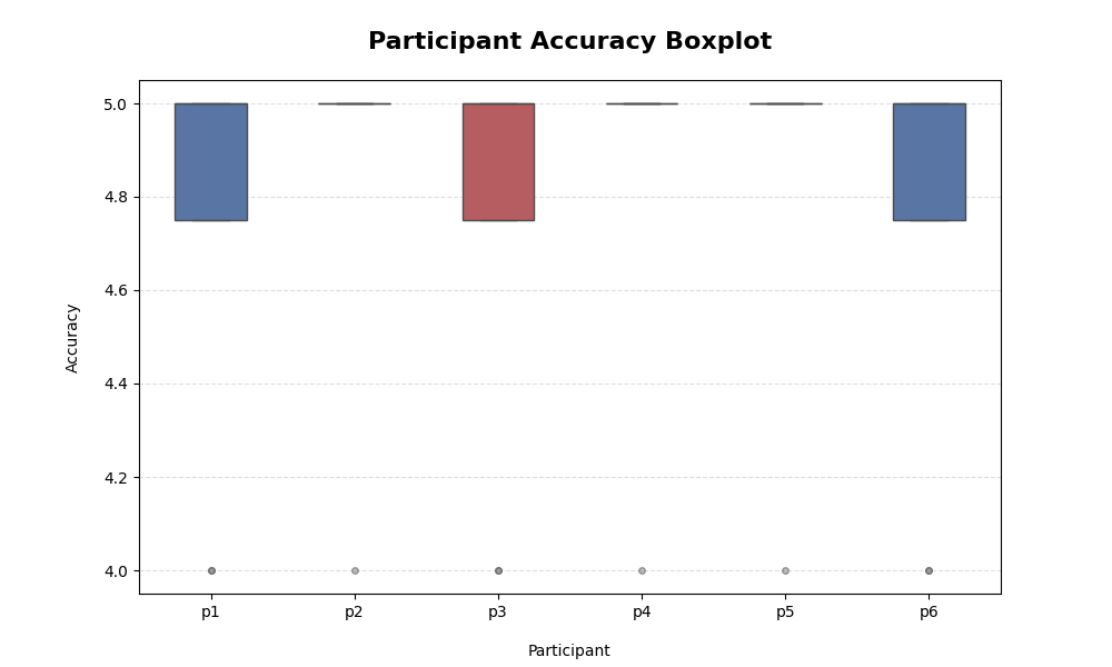
From this, we were able to see that participants' likert ratings were mostly positive, with the majority of ratings lying around a 4 on the graph. Similarly, the participants performed their tasks well, with the majority of tests receiving a 5 in accuracy. Beyond quantitative data though, we received a lot of good feedback on our app. The tests allowed participants to focus their critiques on certain areas as well as bigger picture things, giving us a lot of useful ideas on how to improve the app for the final product. With both types of feedback, we are able to pinpoint exactly which areas need improvement and what we did well in the prototype, so we can keep and change things as we see fit.
Reflection
Final Outcomes
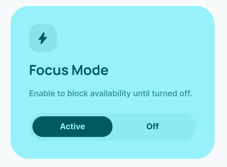
From our feedback and testing results, we were able to select some areas of interest and improve upon them. For example, a recurring piece of feedback was that “Focus Mode” was confusing. We were able to change the wording on its description and button names to provide more concise detail of what the mode does, as well change the interactability of it, making it simpler to use as an effective tool for users.
Figure 6
However, the majority of our feedback revolved around smaller details and we were able to keep most of our prototype the same as participants found it easy to navigate, intuitive, and effective for its job.
Future Direction
As we continue to work on the app, we would like to improve some visual clarity elements, really honing in on our easy information retrieval as that is a priority of our app. Furthermore, we would like to implement some more features into the app such as changing notification settings and adding better profile customization options as per our feedback. A second round of testing for more feedback would then be a great step for us to take once our additions are implemented so that we can make sure that our app's newer changes are as effective as we wanted them to be. Ultimately, we are happy with the app's current prototype and are pleased to only have improvements to make, rather than having to restructure anything.